In today's tech-driven world, our smartphones, tablets, and laptops are equipped with an array of sensors that work silently in the background. Among these, the proximity sensor plays a crucial role in enhancing user experience and conserving battery life. While we rarely see the sensor itself, its functionality is often represented by a small, symbolic icon in system settings, developer menus, or diagnostic screens. This icon, though simple, signifies a complex piece of technology.
A proximity sensor is a device that detects the presence or absence of nearby objects without any physical contact. It typically works by emitting an electromagnetic field or a beam of electromagnetic radiation, often infrared, and looking for changes in the field or return signal. The most common application users encounter is during phone calls. When you hold your phone up to your ear, the proximity sensor detects this and turns off the display. This prevents accidental screen touches with your cheek and saves power.
The icon representing this sensor is usually minimalist and intuitive. It commonly features a stylized representation of two objects or waves with one approaching the other. One prevalent design is a series of concentric arcs or curved lines emanating from a point, symbolizing the sensor's field, with a small object like a dot or a bar positioned at a close distance. Another version might show a simple schematic of a phone with a wave symbol near the earpiece area. The design's primary goal is to be universally understandable, transcending language barriers in global device settings menus.
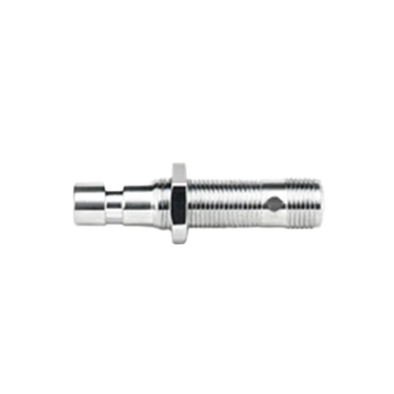
Understanding this icon is more than mere trivia. For the average user, spotting this icon in a settings menu, perhaps labeled "Proximity sensor" or "P-sensor," can be useful for troubleshooting. If your screen fails to turn off during calls, you might navigate to a hardware diagnostic section (often accessed by dialing a specific code like #0on some Android devices) to test the sensor. Here, the icon will be present, and you can activate a test where covering the sensor area should trigger a pass/fail or visual change on the screen. Recognizing the icon helps you identify which component is being tested.
For developers and technicians, this icon is a standard part of the visual language in diagnostic interfaces and system UIs. It allows for quick identification of sensor status and testing routines. In developer options, you might find settings to disable the proximity sensor for specific app testing, again accompanied by this recognizable symbol.
The technology behind the icon is fascinating. Most smartphones use an infrared-based proximity sensor. A small IR LED emits a beam of light, and a photodetector measures the intensity of the light reflected back. When an object, like your head, comes close, the amount of reflected light increases significantly, triggering the system response. Some newer devices employ time-of-flight sensors or even use advanced front-facing camera systems with software algorithms to perform similar functions, but the core purpose and its representative icon remain consistent.
Beyond phones, proximity sensor icons appear in various other contexts. In automotive dashboards, a similar symbol might indicate parking sensor systems. In industrial control panels, it can represent safety systems that detect personnel near machinery. The fundamental symbolism—object near sensor—remains a constant.
While the proximity sensor and its icon are designed to work invisibly, knowing about them empowers users. It demystifies a small part of the complex technology we use daily. The next time you see that small, curved icon in your device's settings, you'll know it represents the tiny component that smartly manages your screen, saving battery and preventing accidental inputs, all by sensing the world just millimeters away from your device. This seamless integration of hardware function and visual software representation is a hallmark of modern user-centric design.