Understanding Proximity Sensor Fundamentals
Proximity sensors are vital components in modern automation, detecting the presence or absence of an object without physical contact. They operate on various principles, primarily inductive, capacitive, and photoelectric. An inductive sensor generates an electromagnetic field and reacts to metallic targets entering this field. A capacitive sensor creates an electrostatic field and detects both metallic and non-metallic materials. A photoelectric sensor uses a light beam, typically infrared, to sense objects. Understanding these basic operating principles is the first step in assessing their condition. A faulty sensor often deviates from its fundamental operational behavior, which can be visually inferred from performance diagrams and its physical state.
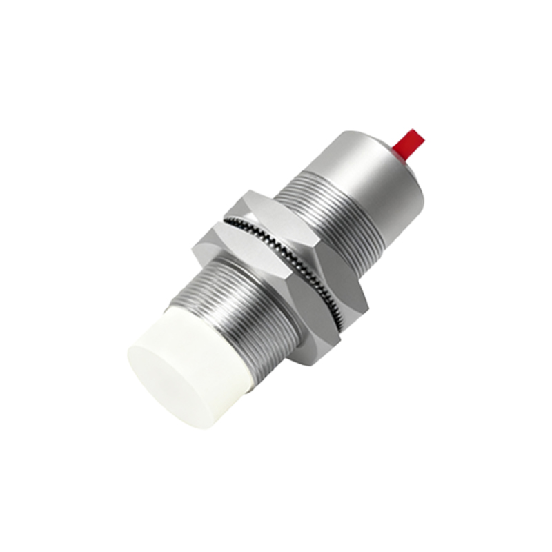
Visual Inspection for Physical Damage
Before any electrical test, a thorough visual inspection is paramount. Examine the sensor's housing for cracks, dents, or severe abrasions, especially around the sensing face. Look for signs of chemical corrosion or melted plastic, indicating exposure to unsuitable environments. Check the cable entry point and the cable itself for cuts, pinch points, or insulation damage. The connector, if present, should be inspected for bent pins, corrosion, or dirt accumulation. A sensor with a cracked housing or damaged cable jacket is highly susceptible to internal failure and environmental ingress, leading to erratic performance or complete failure. This initial visual check can immediately rule out sensors with obvious physical defects.
Interpreting LED Status Indicator Patterns
Most proximity sensors feature a Light Emitting Diode (LED) that provides crucial diagnostic information. Typically, a steady illuminated LED indicates power is present and the sensor is in its normal, non-activated state. A blinking or flashing LED often signifies the sensor is detecting a target within its sensing range. The absence of any LED illumination suggests a power supply issue, incorrect wiring, or a complete internal failure. Some advanced models use different colored LEDs or blinking patterns to indicate specific conditions like short-circuit protection activation or output overload. Refer to the manufacturer's datasheet for the specific LED behavior codes. A diagram correlating LED states to operational status is an invaluable tool for quick field assessment.
Analyzing Output Signal Waveforms
Using an oscilloscope to analyze the output signal provides the most definitive graphical evidence of sensor health. Connect the oscilloscope probes to the sensor's output and power supply lines. For a digital (switching) sensor, the waveform should show clean, sharp transitions between the 'on' and 'off' states with minimal noise or ringing. A slow rise or fall time, excessive noise on the signal line, or an unstable voltage level in the 'on' state indicates potential problems with the output transistor or internal circuitry. Comparing the captured waveform against the ideal waveform diagram from the datasheet will highlight discrepancies. A consistently clean signal confirms good switching performance, while a distorted signal points to degradation or imminent failure.
Measuring Sensing Distance and Hysteresis
Performance degradation often manifests as a change in the sensor's operational characteristics. To assess this, measure the actual sensing distance. Using a calibrated target specified by the manufacturer (e.g., a steel square for inductive sensors), slowly move it toward the sensing face. Note the distance at which the output switches. Compare this to the rated nominal sensing distance (Sn) from the datasheet. A significant reduction (e.g., less than 80% of Sn) indicates a weak oscillator circuit or a dirty/damaged sensing face. Next, measure the hysteresis: the difference between the switch-on point and the switch-off point as the target moves away. An abnormally large or small hysteresis, when plotted on a distance-vs-output diagram, can reveal issues with the sensor's switching threshold stability.
Diagnosing with Response Time Graphs
The sensor's response time is its speed of reaction to a target appearing or disappearing. This is critical in high-speed applications. To evaluate it, create a simple test setup where a target repeatedly passes the sensor at a known speed. Use an oscilloscope to simultaneously capture the target trigger signal (perhaps from a second reference sensor) and the output signal of the sensor under test. Measure the delay between the two signals. Plotting this delay over multiple cycles creates a response time graph. A stable, consistent delay that matches the datasheet specification indicates good health. Increasing delay, jitter (variance in delay), or missed detections shown on the graph are clear signs of a failing or overloaded sensor.
Environmental Interference and False Triggering
A common symptom of a problematic sensor is false triggering or failure to trigger. Diagram the installation environment to identify