In the intricate visual language of modern devices, a small yet significant symbol often appears: the proximity sensor icon. This icon, typically depicting two curved lines radiating from a point or a stylized "P," serves as a silent communicator of a critical but invisible function. Unlike flashy camera or Wi-Fi symbols, its role is subtle, yet it is fundamental to the seamless operation of smartphones, tablets, and various industrial equipment. Understanding this icon is key to comprehending how our devices interact with the physical world around them.
At its core, a proximity sensor is a non-contact device that detects the presence or absence of an object within a specific range. The icon visually represents this action of detection or wave emission. The most common representation involves two concentric arcs or curved lines, suggesting the emission of a signal—often infrared (IR) light—and its return. This simple graphic elegantly conveys the concept of "nearness" without words. In some system settings or developer menus, you might encounter a more technical variant, sometimes a circle with waves or a simple "P" label.

The primary function this icon indicates is power conservation and accidental touch prevention. When you hold your phone to your ear during a call, the proximity sensor detects your cheek and automatically turns off the display. This prevents your ear or face from accidentally pressing buttons and saves battery life. The icon may briefly appear in the status bar during this event on some devices. In this context, the icon is a sign that an intelligent, energy-saving process is at work. Another critical application is in automated systems. For example, in a modern hand dryer, a proximity sensor triggers the airflow. The icon on the device signifies touch-free, hygienic operation.
From a design perspective, the proximity sensor icon adheres to the universal principles of effective pictogram design: simplicity, recognizability, and consistency. Its design must be abstract enough to be understood across cultures but specific enough not to be confused with other wave-related icons, like Wi-Fi or radiation symbols. The use of symmetrical curves evokes a sense of a field or zone, which is precisely what the sensor monitors. In user interface (UI) design, when this icon is used within an app or settings menu, it is almost always paired with text for absolute clarity, such as "Proximity Sensor" or "Turn off display during calls."
For users, seeing this icon can resolve minor confusions. If the icon appears stuck in the status bar or the screen turns off unexpectedly when not on a call, it might indicate a software glitch or sensor blockage by a screen protector. Recognizing the icon allows users to troubleshoot effectively, perhaps by cleaning the sensor area or checking relevant settings. In industrial control panels, the icon labels sensors that ensure safety, preventing machinery from operating when a person is too close.
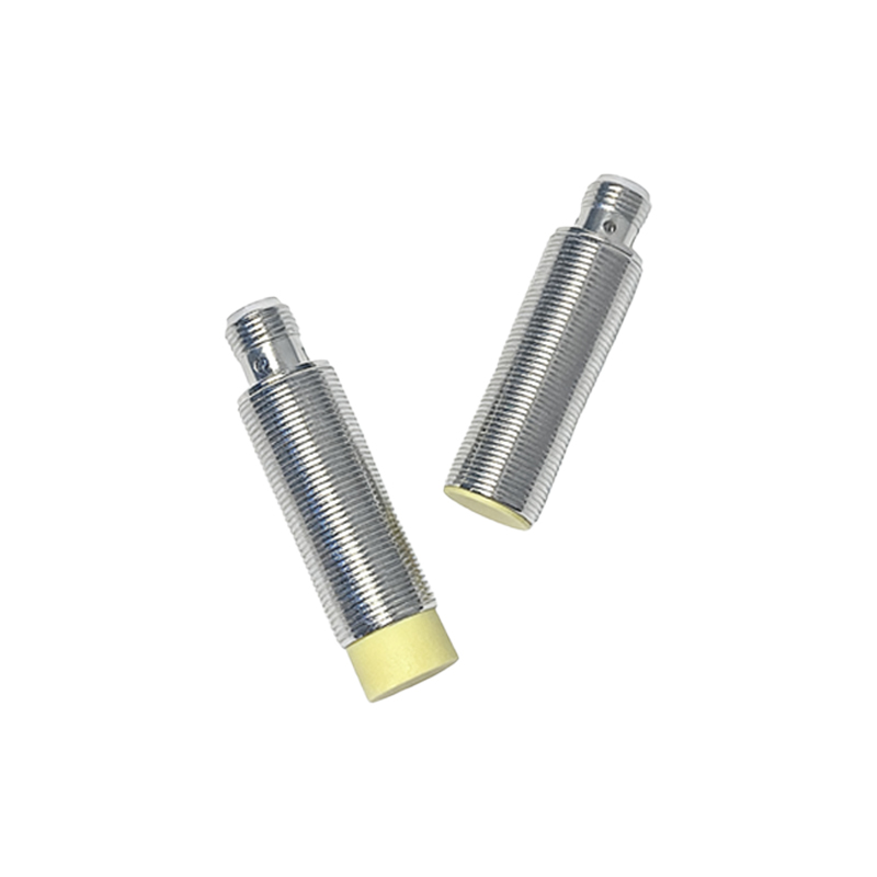
The development of this icon mirrors the evolution of sensor technology itself. Early devices had no need for such an icon, as the function was entirely hidden. As sensors became more sophisticated and user-configurable, a visual representation became necessary for technical documentation, settings menus, and diagnostic tools. Its standardization, while not absolute, is encouraged by platform guidelines like Google's Material Design and Apple's Human Interface Guidelines, which promote a cohesive visual language.
In summary, the proximity sensor icon is a small gateway into a world of hidden technology. It represents the elegant, automated interactions between our digital devices and the physical environment. By demystifying this symbol, users can better appreciate the intelligent design of their gadgets and troubleshoot issues more confidently. It stands as a testament to how good design can make complex technology intuitive and unobtrusive, functioning perfectly in the background until the moment we need to understand it.