In the realm of industrial automation and electrical engineering, proximity switch sensors play a crucial role in detecting the presence or absence of objects without physical contact. These devices are widely used in machinery, conveyor systems, and safety applications, making their representation in technical documentation and diagrams essential for clear communication. Icons and symbols for proximity switch sensors serve as a universal language, enabling engineers, technicians, and designers to quickly interpret circuit layouts and system functionalities. This article delves into the standard icons and symbols associated with proximity switch sensors, their variations, and best practices for usage in electrical diagrams.
Proximity switch sensors are typically categorized based on their sensing technology, such as inductive, capacitive, ultrasonic, or optical types. Each category has distinct operational principles, which are often reflected in their graphical representations. In electrical diagrams, these sensors are depicted using standardized symbols established by organizations like the International Electrotechnical Commission (IEC) and the Institute of Electrical and Electronics Engineers (IEEE). For instance, an inductive proximity sensor, commonly used for detecting metallic objects, is represented by a square or rectangular shape with a diagonal line or wave symbol inside, indicating electromagnetic fields. Capacitive sensors, which can detect both metallic and non-metallic materials, may include additional lines or curves to signify capacitance. Optical sensors, including infrared or laser types, often feature light beam symbols, such as arrows or dotted lines, to represent emission and reception paths.
The importance of accurate iconography cannot be overstated. Misinterpretation of symbols can lead to design errors, operational failures, or safety hazards. Therefore, it is vital to adhere to industry standards when creating or reading diagrams. A typical proximity switch sensor icon includes basic elements: a geometric shape (e.g., circle, square) denoting the sensor body, internal markings for sensing type, and connection points for wiring. For example, a common symbol might show a circle with two parallel lines inside for a magnetic proximity switch, while an ultrasonic sensor might incorporate sound wave patterns. Additionally, annotations or labels near the icon provide further details, such as model numbers, detection ranges, or output types (e.g., PNP or NPN for transistor outputs). These labels enhance clarity, especially in complex diagrams with multiple sensors.
Variations in symbols can arise due to regional standards or specific manufacturer guidelines. While IEC symbols are widely adopted in Europe and many international projects, IEEE standards are more common in North America. Some companies also develop proprietary symbols for their products, which may deviate slightly from universal norms. Engineers must be aware of these differences to avoid confusion. For instance, a proximity sensor icon in an American diagram might use a diamond shape with internal markings, whereas an IEC-based diagram could employ a square. It is recommended to include a legend or key in diagrams to explain any non-standard symbols, ensuring all stakeholders can accurately interpret the design.

In practice, creating effective diagrams involves more than just placing icons. Proper spacing, alignment, and color coding contribute to readability. For proximity switch sensors, it is common to use consistent colors—such as blue for inductive sensors or green for optical types—to visually group similar components. Digital tools like CAD software and electrical design platforms often include libraries of pre-drawn symbols, streamlining the diagramming process. However, users should verify that these symbols align with current standards, as outdated versions may cause discrepancies. Regular training and reference to official standards documents, such as IEC 60617 or IEEE 315, help maintain accuracy.
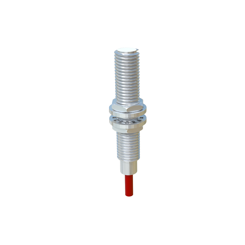
Beyond static diagrams, proximity switch sensor icons are also integral to dynamic systems like programmable logic controller (PLC) programming interfaces and human-machine interface (HMI) screens. Here, icons may be interactive, changing color or shape to indicate sensor status (e.g., active, faulty). This real-time feedback enhances troubleshooting and monitoring, underscoring the icon's role in operational efficiency. For example, a flashing icon might signal an object within detection range, while a grayed-out symbol could indicate a disconnected sensor. Integrating these visual cues into control systems requires collaboration between electrical engineers and software developers to ensure consistency across platforms.
In conclusion, proximity switch sensor icons and symbols are fundamental tools in electrical engineering, bridging the gap between technical specifications and practical implementation. By understanding standard representations, variations, and best practices, professionals can design clearer, safer, and more efficient systems. As technology evolves, with trends like Industry 4.0 and IoT integration, these symbols may adapt to include new features, but their core purpose—to convey information succinctly—will remain vital. Always prioritize clarity and adherence to standards when working with these critical components in diagrams and documentation.